a

All ideas streamlined into a single flow of creativity. SmiltÄ—.

LA offices

The Creative Strategy Agency

A creative agency with big ideas and bigger ambitions.

Introduction

The Creative Strategy Agency sought to take its brand one step ahead to reflect its essence and connect with its audience. I developed this comprehensive project that included a visual audit, a visual identity refresh (not a complete rebranding), website design, and Webflow development.

Visual Identity

Digital Design

UI/UX

Art Direction

thecreativestrategysite.com

Visual Identity Audit

To kickstart the project, I conducted a visual identity audit. The main objective was to gain insights into the current state of the brand, identify opportunities for improvement, and develop strategic recommendations to support the foundations of their visual identity.

Previous Visual Identity

Key Findings

Logo lockups

Lack of guidelines for logo variations leads to inconsistencies and weakens brand recognition.

Too many colors

Overuse of 9 primary colors creates clutter and reduces brand identity impact.

Picky typeface

Dependence on Klarheit Grotesk poses accessibility challenges and potential inconsistencies due to licensing constraints.

Overwhelming visuals

Diverse color use in visual elements causes clutter, overwhelming users and hindering brand recognition.

Visual Identity Refresh

The visual identity refresh addressed key findings from the audit to ensure a cohesive brand presence. We defined a single primary logo lockup for consistent usage, refined the color palette to two primary colors with vibrant accents for visual cohesion, and transitioned to Google Fonts for enhanced accessibility and consistent typography.

The Frame

Contrary to popular belief, creativity thrives within structures, and The Frame offers the perfect balance of structure and freedom. The Frame highlights the agency’s ability to provide a structured framework for creative ideas to flourish. This duality appeals to clients seeking innovative yet organized solutions. The Frame will be the foundation of our visuals.

Website Design / Development

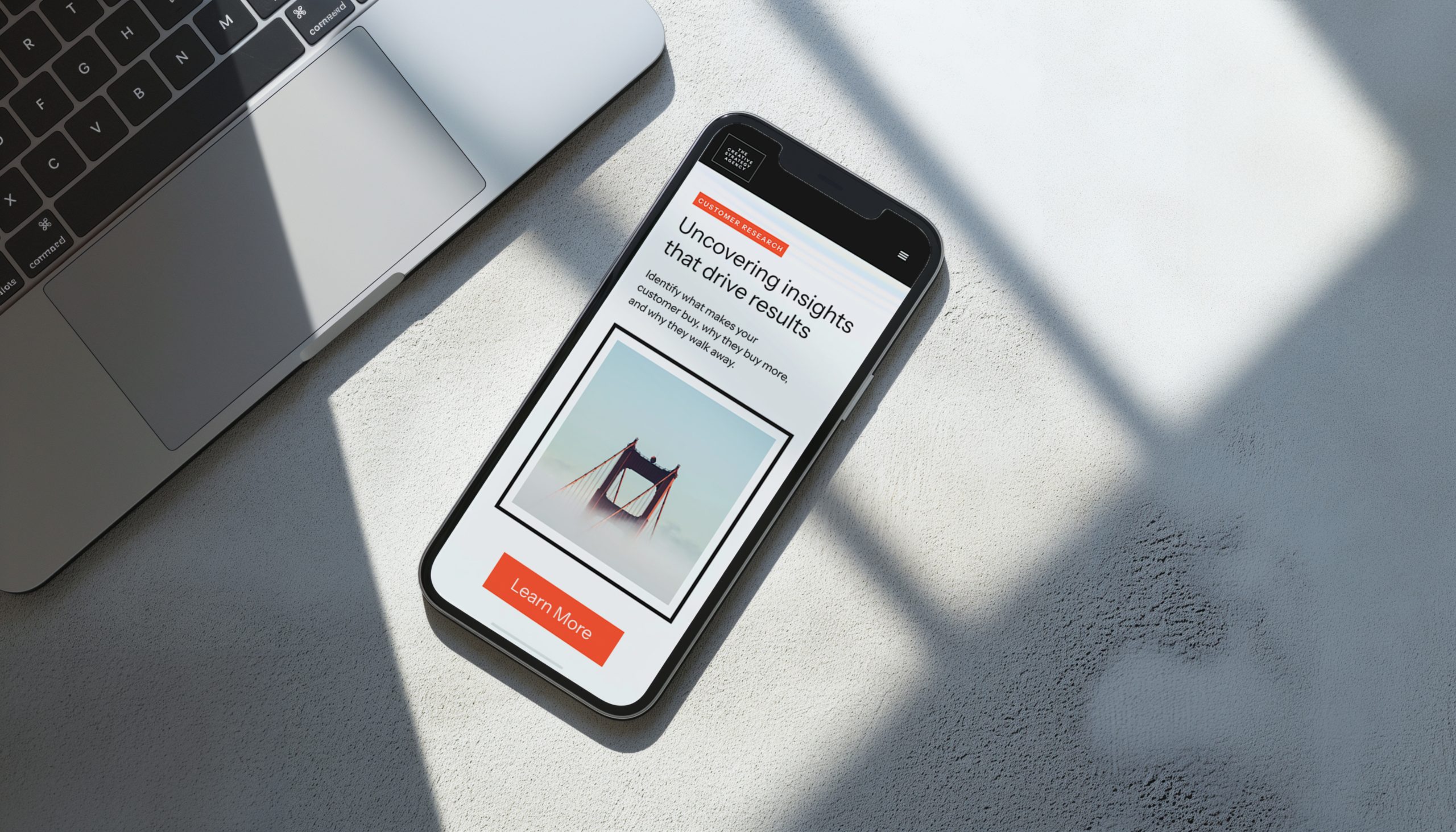
Designing and developing the website for TCSA required a thoughtful approach. After defining the new visual identity elements, we created a website that would effectively communicate the agency’s branding and offering. The following pillars guided the design and development process, resulting in a website that provides visitors an engaging experience.

One-page site

Streamlined one-page structure that enhances navigation and a clear communication.

The Frame

To reinforce brand identity and maintaining visual interest.

Accents of color

To highlight key elements, guide interaction, and evoke emotions.

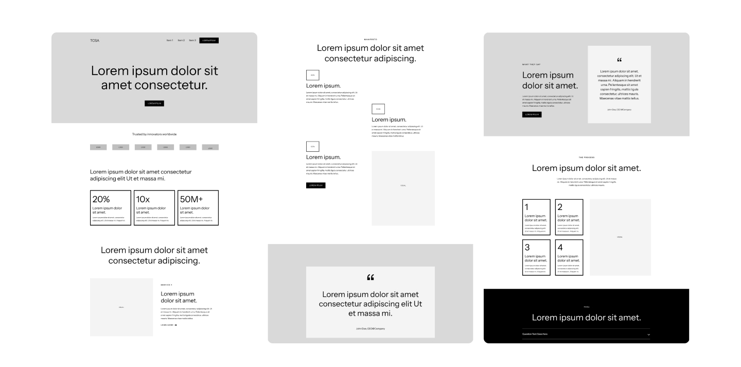
Wireframes

Hifi Mockups and Prototypes

After defining the sections and flow in the wireframes, we transitioned to designing high-fidelity mockups and prototypes with Figma. This allowed us to visualize and interact with the website’s design and functionality before advancing to the Webflow development phase.

Webflow Development

Once hifi mockups were approved, we implemented them in Webflow, enabling complex interactions, animations, and ensured responsiveness across devices. Webflow’s features brought the website to life efficiently, aligning perfectly with the agency’s objectives.

Oscar is amazing! He is an incredibly talented, organized, trustworthy design team leader. His project management skills, poise, and visual design abilities are superb. Oscar is calm under pressure, proactive, friendly, easygoing and generally terrific. No job is too small or too big for him.

Next