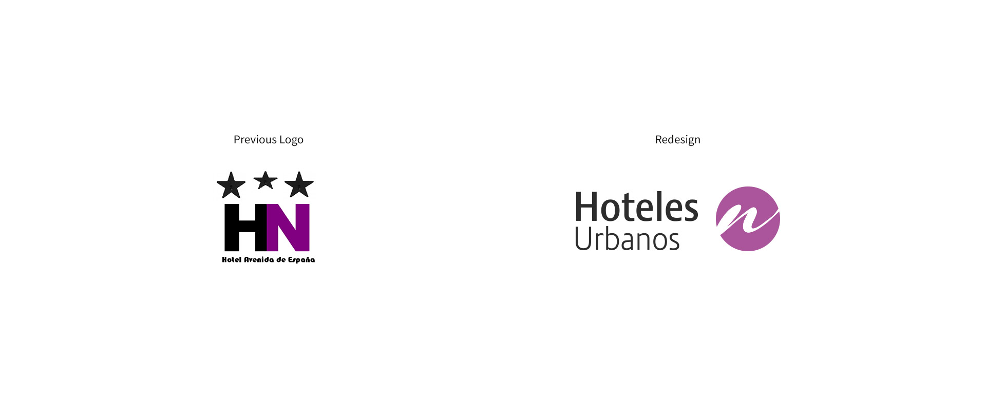
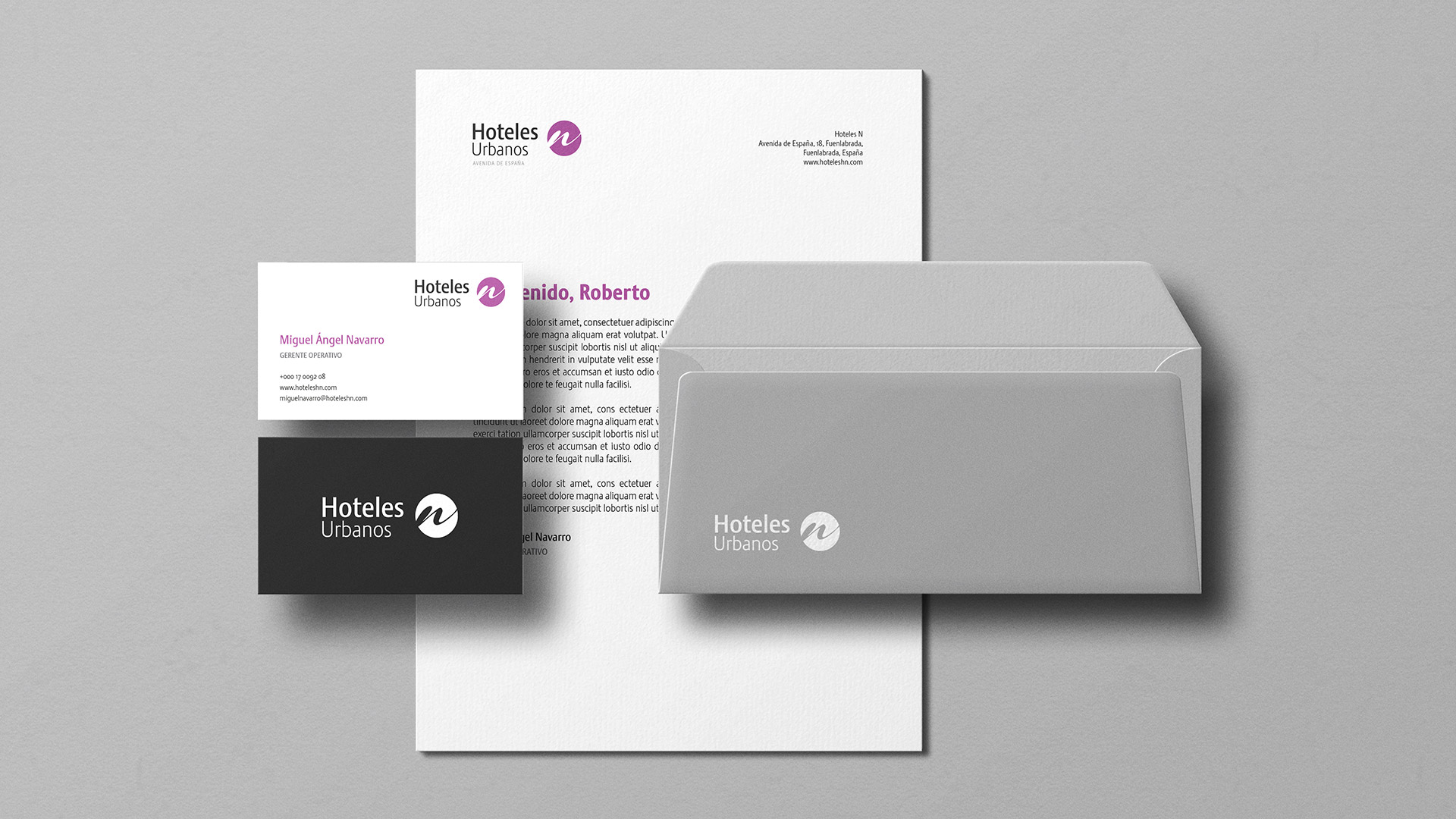
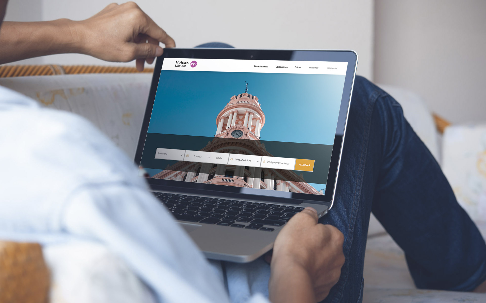
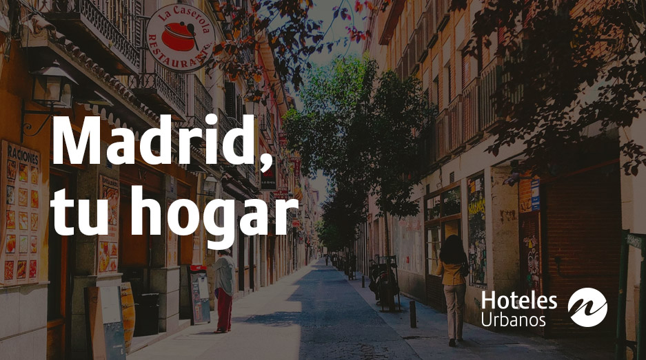
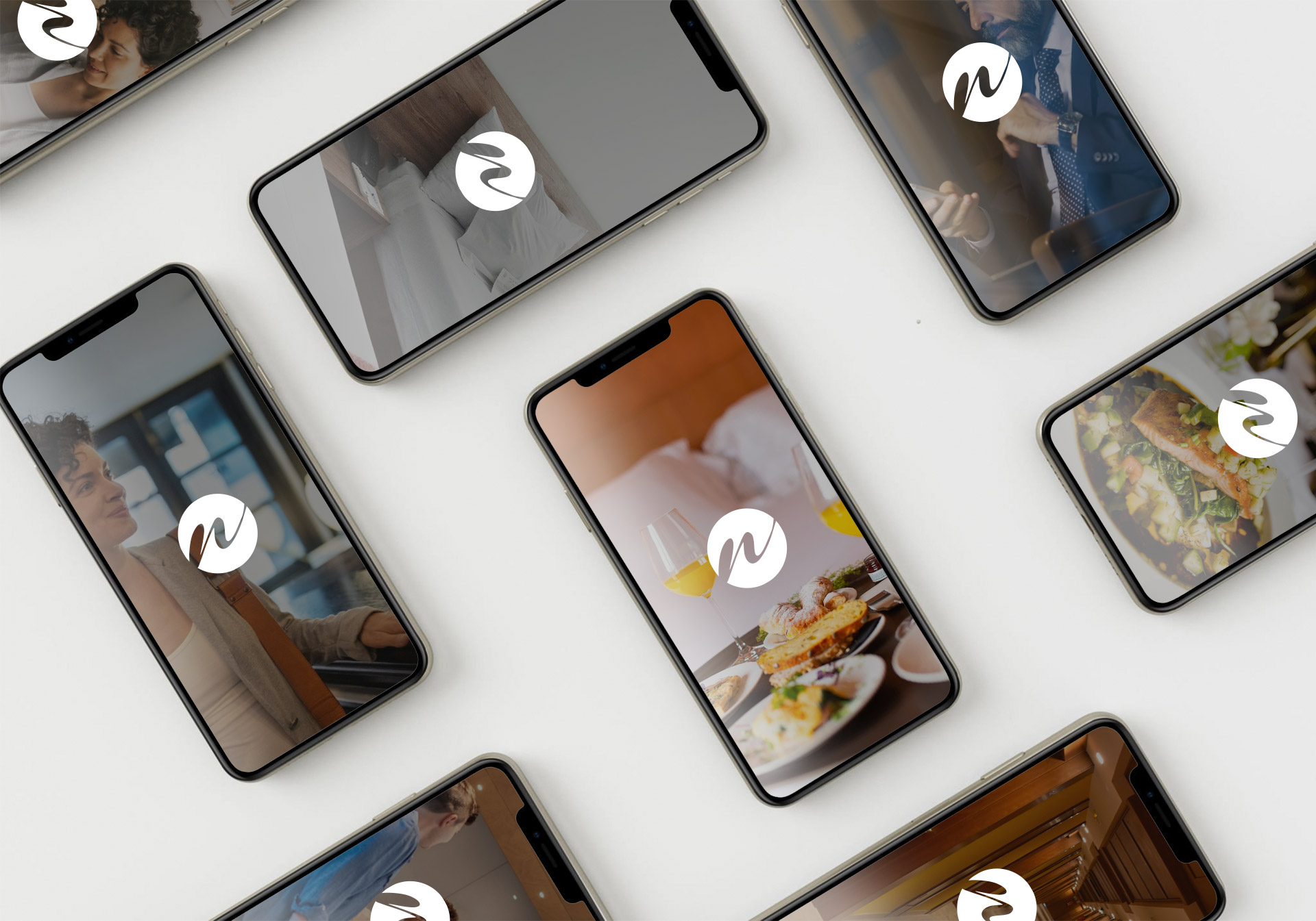
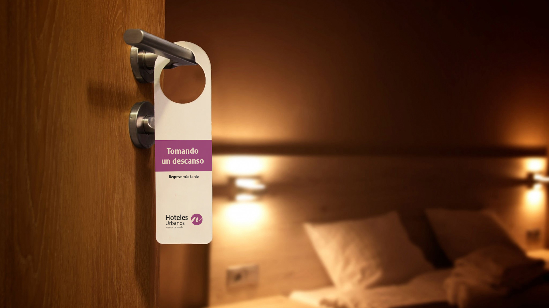
The mission: create a cohesive brand for Hoteles Urbanos N and its diverse properties. I forged a visual identity featuring a unique symbol, custom color palette, and typography system. This identity flowed seamlessly across stationery, digital materials, and more. A comprehensive Visual Identity Manual, outlining guidelines from logo use to color combinations, ensured consistency across touchpoints. The project illuminated the significance of visual identity in hospitality, establishing a unified brand that not only reflected the group’s personality and values but also helped Hoteles Urbanos N distinguish itself in a competitive landscape, delivering a memorable experience for guests.